This music video inspired many of our shots that were used in our music video, such as the shots of the artist performing with the guitar. James Morrison and Jack Johnson also come from similar genres of rock.
Narrative:

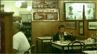
 The narrative parts of the video have been set in many different locations such as in a cafe, on the streets, in a car and in an apartment. Throughout all the narrative sequences, the artist is alone and appears to be lost and drifted. The narrative scenes illustrate the lyrics for example when he says 'So much craziness surroundin' me' a hall is shown which with people standing around, with equipment scattered everywhere.Vernallis stated that The video is a visual response to the music, which applies to this music video. Although Vernallis said that the There is not necessarily a balance between narrative and performance, which I feel this video goes against, as it has a fair balance of narrative and performance sequences. The narrative does not tell a story, but shows the actor's pain and other emotions. The video supports Vernallis' argument that The narrative is not always complete - it may be partial, fragmented narrative. At the end of the video we see the artist walking off not giving a clear a ending of what happens to the actor. This supports Vernallis' theory that There may not always be a clear resolution (closure) at the end.
Editing:
 The editing flows with the beat of the song in some parts of the video and changes with the lyrics of the song to illustrate them. Therefore Vernallis is right is saying Editing may match the musical phrases or the beat. During half way, the tune becomes a little faster and more intense, where there is a use of more shots and faster cutting. The video does break or disrupt many of the 'rules' of continuity editing, however some of the shots are able to flow into each other quite well, and the cutting still keeps to the lyrics illustrating them.
Camera Movement and Framing:

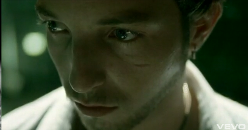
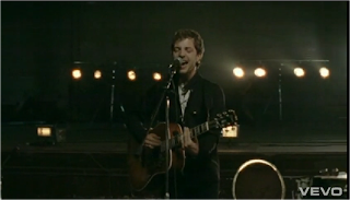
 The video consists of many close-ups of the artist singing with emotion. This supports Vernallis' statement that Close-ups are frequently used'. Close-ups help the audience to understand what the song means to the artist, especially in this video. She also says that The master shot (or other establishing shots) is used frequently which applies to this video, as the video is set in many different locations. The audience are introduced to the different locations with long shots of the areas in which the artist is in. For example to the left is screen grab from the video, showing the cage the artist is in, his location. Similar frames and movements are used throughout the video, with the camera moving around the artist or with the artist while he walks around. This supports her theory that The style of framing and movement may run through the video and is distinctive to that video.
Diegesis:

 As the melody of the song is quite slow, so is the revealing of the diegesis. This supports Vernallis' statement that The diegesis may be revealed quite slow. Half a minute into the video, we find out that the artist is traveling somewhere. The narrative parts of the video do not complete before changing to the performance parts. The audience are not told the full story as the video is broken up. Vernallis also says that Actions are not necassarily completed - they may be disrupted or interrupted in some way. By doing this the video also supports Vernallis' statement that There may be gaps in the audience's understanding of the diegesis - in time and space, music performance and narrative. Some of the performance parts have been cut for longer in the video, to emphasise the lyrics meanings. This supports what Vernallis said that Some frames may be more important.

Camera Movement and Framing:

 The video consists of many close-ups of the artist singing with emotion. This supports Vernallis' statement that Close-ups are frequently used'. Close-ups help the audience to understand what the song means to the artist, especially in this video. She also says that The master shot (or other establishing shots) is used frequently which applies to this video, as the video is set in many different locations. The audience are introduced to the different locations with long shots of the areas in which the artist is in. For example to the left is screen grab from the video, showing the cage the artist is in, his location. Similar frames and movements are used throughout the video, with the camera moving around the artist or with the artist while he walks around. This supports her theory that The style of framing and movement may run through the video and is distinctive to that video.
Diegesis:

 As the melody of the song is quite slow, so is the revealing of the diegesis. This supports Vernallis' statement that The diegesis may be revealed quite slow. Half a minute into the video, we find out that the artist is traveling somewhere. The narrative parts of the video do not complete before changing to the performance parts. The audience are not told the full story as the video is broken up. Vernallis also says that Actions are not necassarily completed - they may be disrupted or interrupted in some way. By doing this the video also supports Vernallis' statement that There may be gaps in the audience's understanding of the diegesis - in time and space, music performance and narrative. Some of the performance parts have been cut for longer in the video, to emphasise the lyrics meanings. This supports what Vernallis said that Some frames may be more important.


