Dear Moderator,
Thank you, for looking at my blog and hope you enjoyed watching the final version of our music video!
Devki Mistry
Saturday, 10 December 2011
Improvements Made
Improvements made to my Ancillary Tasks:
To my ancillary tasks I have made
a couple of changes, after noticing that some of the text was not very clear
and one of the panels did not flow with the whole theme and colour of the CD
covers.
On the front cover of my CD
cover, I decided to enlarge the text as it was not very clear. After
researching different CD covers, I noticed that the name of the artist stood
out on the cover. I also changed the font of the text to a simpler one so that
it would be more readable. The font on the back cover was also changed as to
become a little clearer. This was done by changing the font type to the same
one used on the front cover and taking the ‘outer glow’ effect off as it made
the text unclear. The text was also enlarged.
Another change made to my 4 panel
CD cover was the left inside panel. Originally we had made a collage of
pictures of the artist, from when we were shooting the music video. However it
looked unprofessional and messy therefore we decided to replace it with a
picture of the couple we used in our music video holding hands. Using only
their hands helped to emphasize and signify the idea of relationships and ‘togetherness’.
We felt this linked well with the meaning of the song and also looked professional
after editing it on Photoshop. To edit the photograph, we enhanced the colour
by increasing the contrast and brightness and also added a ‘photo filter’ which
gave the image a sepia tint. To make sure the hands were the main focus of the
panel we decided to blur the background (the grass).
Improvements made to my Music Video:
0:15-0:20: We swapped the previous behind the scenes
clip for a different one, this was because we found the prior clip mislead
people watching it, as they thought the lip sync was off because they saw the
artist moving his lips. However it was not off sync, the clip showed the artist
talking in one of our behind the scenes clip, but ot avoid this misconception
we decided to change the clip altogether.
0:42-0:45, 1:02-1:05, 2:08-2:10, 2:32-2:33: At all
these points in our music video we included new footage of another couple who
are in a loving relationship, instead of the original still images we had. We
did this because we felt that with the nature of the song being about
relationships, automatically you (the audience) would think about couples and
different relationships.
1:02-1:05: We used this clip to replace the original
freeze frame of our behind the scenes clip, because what we tried to achieve
with the still image changing into a moving image did not work therefore we
chose to replace it with our loving couple.
1:34-1:38, 1:47-1:51: These shots show the
relationship between siblings, we felt we should include different
relationships so that a wider audience could relate to the song when watching
the video, these were also used instead of the still images in the original
cut. The reason we chose to jump cut these shots was because we wanted to
editing to flow, as there are also a few jump cuts of our artist at 2:23-2:27.
Friday, 9 December 2011
Thursday, 8 December 2011
Evaluation Task 3 - What have you learned from your audience feedback?
Positive Feedback of music video:

Negative Feedback of music video:

We have now improved our video and ancillary tasks. At 0:40 in the video above, we mention how the audience really liked the part in our music video where the picture blurs into the video of behind the scenes. In our improved version of the video we decided to remove the shot blurring into the video and replaced it with the couple, as it related to the lyrics and song more.
Feedback on improved Video
- The addition of the couple linked in and portrayed the lyrics well
- The gap between the clips of the two sisters makes the audience want to watch on, to find out what happens next
Feedback on my improved Digipak
- The inside panel of the hands together, links in well with the song
- Really liked the idea of the photograph behind where the CD is to be placed.
- Could have blurred background of grass further to make the hands stand out against it more.
- On our previous digipak, feedback we recieved was that the text on the spine was not readable, therefore we used Photoshop to make it bolder and larger
Wednesday, 7 December 2011
Tuesday, 6 December 2011
Evaluation 1: In what ways does your media product use, develop or challenge forms and conventions of real media products?

1. This shot shows a relationship between the lyrics and visuals, where we see a shot of a couple with their arms around each other, together while the lyrics says 'it's always better together when we're together'. The visuals illustrate 'togetherness', linking the lyrics with the visuals.
2. The shot shows the artist walking in a natural environment holding his guitar, looking around and smiling, showing he enjoys natural areas, giving off a positive vibe. He also has his guitar with him which hints that it is important to him, and symbolizes his music. The guitar is also present on his album covers and magazine advert. He is wearing a hat and sunglasses which are part of his iconography. His costume is casual and simple emphasizing that he is quite easy going. He is smiling portraying a positive attitude.
3. This shot portrays a a song from an acoustic genre as the artist is playing a guitar. It also suggests this instrument is played in all of his songs. The clothing compliment the genres of soft rock, as it is casual and simple.
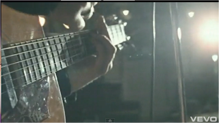
4. This shot was inspired by James Morrison's video 'You Make It Real'. It is a close-up shot of the artist playing the guitar and thought we would include it in our music video as it really shows of the artist's talent.
5. This low angle of the couple is able to emphasize their expressions and also the word 'memories', linking the visuals back to the lyrics. It also gives another perspective to their relationship, showing that they have balanced 'power' and status in their relationship. They have also been kept the main focus of the shot, with no other objects that would distract the audience.
6. This shot is from a scene that was shot in a room. To make the room brighter we had to switch the light on and we also used a lamp which was placed near the bed. We opened the curtains to capture as much light as we could. The shots shows when we faded the sun into the light in the room.
7. The shot is set in a natural environment, with the artist casually sitting by the tree playing his guitar. It also gives the audience an idea of the artists style which is given off by his clothing.
8. This shot has been taken from one of Jack Johnson's video. It is black and white and is showing a bit of behind the scenes of the video. The artist looks happy giving off a positive attitude, and the clothing looks casual. It is a low angle of the artist showing trees as the background. He also has his guitar in his hand. We have included 'behind the scenes' footage throughout our music video, giving the audience an idea of what the artist's character.
9. A screen grab from John Mayer's video 'Who Says'. The shot is of a photograph of the artist at a party dancing. Throughout the video the artist has included photographs which have been edited to have a blue tint effect. We were inspired by this and included the photograph idea into a music video, including photographs of 'behind the scenes'.


Nine frame of Other Videos
1. This shot shows the relationship between the lyrics and visuals, where we see a shot of the artist lying down with a women, holding her hand, while the lyrics say 'I won't let you go'. The image the two holding hands conveys the idea of them not letting go of each other, being together. The shot was taken from James Morrison's video 'I Won't Let You Go'.
2. The shot shows the artist sitting in a chair, playing his guitar and singing. He is leaning his foot up against a wall, showing he is pretty laid back and chilled. Whilst playing the guitar the artist also walks around emphasizing that he enjoys playing his guitar in his spare time, showing passion. In the shot we also see the artist's style as casual.The shot is a screen grab from John Mayer's video 'Who says'.
3. This frame portrays a song an acoustic genre as the artist is playing a guitar and singing into a mike. The artist shows expression on his face and appears to be singing with emotion. The song is about how a person means to someone, with the theme of love.
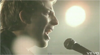
4. This is a close-up of the artist singing into a mike. Close-ups of the artist singing are usually filmed in rock music videos. Close-ups of instruments are also used frequently in this music genre, to emphasize the artist's talents.
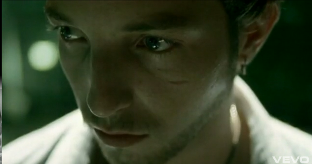
5. A close-up shot of the artist singing with emotion. The artist is looking directly at the camera connecting with the audience, showing them how he really feels, emphasizing the lyrics. The audience are able to focus on him without getting distracted by things in the background as it has been blurred.
6. This is an establishing shot of room. The light source in this shot is the lamp. In the video the lamps are what make the room brighter and create reflections on the window, showing the second female artist. This shot was taken from James Morrison's video 'Broken Strings'.
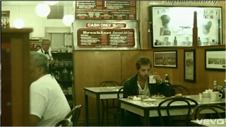
7. The shot has been taken from James Morrison's video 'You Make It Real For Me'. The performance parts of the video where the artist is singing has been set in what looks like a hall. In the shot we see people setting up equipment, whilst the artist is casually singing at the front of the hall. The hall is spacious and we are also able to see spot lights at the front of the hall. This shot also correlates with the lyrics as the lyrics say 'So much craziness surroundin' me, so much goin' on, it gets hard to breathe'.
 8. This shot is also from James Morrison's video 'Broken Strings'. We really liked this shot as used it as inspiration in our video. The frame in James Morrison's video was shot with the artist positioned to the side of the frame, leaving space. We tried to recreate this, however we shot the artist a little to the side of him, getting the natural setting in as well.
 9. This shot was taken from John Mayer's video 'Waiting On The World To Change'. It is a front, side shot of the artist, walking and singing. We did a slightly similar shot in our music video, a side front shot of the artist singing.
4. This is a close-up of the artist singing into a mike. Close-ups of the artist singing are usually filmed in rock music videos. Close-ups of instruments are also used frequently in this music genre, to emphasize the artist's talents.
5. A close-up shot of the artist singing with emotion. The artist is looking directly at the camera connecting with the audience, showing them how he really feels, emphasizing the lyrics. The audience are able to focus on him without getting distracted by things in the background as it has been blurred.
6. This is an establishing shot of room. The light source in this shot is the lamp. In the video the lamps are what make the room brighter and create reflections on the window, showing the second female artist. This shot was taken from James Morrison's video 'Broken Strings'.
7. The shot has been taken from James Morrison's video 'You Make It Real For Me'. The performance parts of the video where the artist is singing has been set in what looks like a hall. In the shot we see people setting up equipment, whilst the artist is casually singing at the front of the hall. The hall is spacious and we are also able to see spot lights at the front of the hall. This shot also correlates with the lyrics as the lyrics say 'So much craziness surroundin' me, so much goin' on, it gets hard to breathe'.


Promoting our Music Video, Digipak and Magazine Advert

As you can see I uploaded our final cut of the music video onto Facebook to get as much feedback as we could. We recieved a couple of 'likes' and people said that they really liked our video!

I also uploaded all of our album covers and both our magazine adverts and asked to get as much feedback as we could.
Monday, 5 December 2011

Editing in Final Cut Express


This is a screengrab sowing how we made some of our shots in black and white. We did this to all of our behind the scene shots. This was done using the colour corrector in final cut.
Another cut of our Video
This is another cut of our video. We found that the shots were lasting too long, which made the video flow very slow. Therefore we are planning to create more cuts and add images from 'behind the scenes' between the cuts. We also need to add more transitions.
Inspiration -IMPROVED
While looking through similar artists videos, we found this video and were inspired by how the video includes photographs of the artist and other people around him. The photographs have been edited to be slightly tinted blue. We are going to try and add some photographs from behind the scenes of shooting and create a similar kind of effect.
 We were really inspired by how photographs were edited within the video. However they did flow with the sequence. Another thing we really liked about the photographs were that they were not directed, they were casual which also reflects the artists character. We would like incorporate photographs into our video to show the artists character behind the scenes of shooting for the video.
We also liked the shots of where the artist walks around casually around a kitchen playing his guitar. It portrays the artists passion for playing his guitar, which we want to create in our video. We try to recreate this in our video which will hopefully give off the same effect.

This is another shot of the artist casually chilling and playing his guitar, which we hope to recreate in our video.
Inspiration -IMPROVED
Many of the shots used in this video inspired the shots filmed in our video. There are many shots of James Morrison singing with passion in the video. We recreated this and filmed many shots of the artist singing and enjoying himself. There are also many close-ups at an angle of the artists guitar, which was inspired by this video also.

This is a close-up that was used in the video. This shot was really strong as it was able to portray the pain and emotions that the artist was feeling in the video. We will use this shot in our video and hope the audience will pick up our artists character.

 This close-up of the guitar was shot, which we were inspired by and have decided to use it in our video. It shows of the artists talent for playing the instrument.
Final Digipak - IMPROVED
This is my final digipak. I decided to keep it as 4 panels. The front
and back covers main focus are on the artists guitar. To do this we
blurred the background using tools on Adobe Photoshop. It looks a little
mysterious as the artists face is not shown, which I felt is quite
effective. His clothing in the front and back cover portrays how the artist is casual and simple in his sense of style and character. We kept the fonts very simple to represent the artists
character and genre of music and also so that it was clear and readable.

The bottom right panel is where the CD will be placed. We thought this fit in well with the shape of guitar. For the left inside panel we decided to place a photograph of a couple holding hands to signify togetherness. The couple used for the photograph also feature in our video.
Rough Cut
This is our rough cut. We found that the shots were too long, so we need to have more cuts. The lighting in one of the shots is very dark, therefore we need to use the 'colour corrector' tool on Final Cut to brighten the shot. We are also going to add images from behind the scenes into our video.
Photographs taken for Digipak
These were a few photographs we took for our digipak. We used the same couple as were used in parts of our video. We did this to create a link between our digipak and video.
Wednesday, 30 November 2011
Vernallis Analysis of 'You Make It Real For Me' by James Morrison
This music video inspired many of our shots that were used in our music video, such as the shots of the artist performing with the guitar. James Morrison and Jack Johnson also come from similar genres of rock.
Narrative:

 The narrative parts of the video have been set in many different locations such as in a cafe, on the streets, in a car and in an apartment. Throughout all the narrative sequences, the artist is alone and appears to be lost and drifted. The narrative scenes illustrate the lyrics for example when he says 'So much craziness surroundin' me' a hall is shown which with people standing around, with equipment scattered everywhere.Vernallis stated that The video is a visual response to the music, which applies to this music video. Although Vernallis said that the There is not necessarily a balance between narrative and performance, which I feel this video goes against, as it has a fair balance of narrative and performance sequences. The narrative does not tell a story, but shows the actor's pain and other emotions. The video supports Vernallis' argument that The narrative is not always complete - it may be partial, fragmented narrative. At the end of the video we see the artist walking off not giving a clear a ending of what happens to the actor. This supports Vernallis' theory that There may not always be a clear resolution (closure) at the end.
Editing:
 The editing flows with the beat of the song in some parts of the video and changes with the lyrics of the song to illustrate them. Therefore Vernallis is right is saying Editing may match the musical phrases or the beat. During half way, the tune becomes a little faster and more intense, where there is a use of more shots and faster cutting. The video does break or disrupt many of the 'rules' of continuity editing, however some of the shots are able to flow into each other quite well, and the cutting still keeps to the lyrics illustrating them.
Camera Movement and Framing:

 The video consists of many close-ups of the artist singing with emotion. This supports Vernallis' statement that Close-ups are frequently used'. Close-ups help the audience to understand what the song means to the artist, especially in this video. She also says that The master shot (or other establishing shots) is used frequently which applies to this video, as the video is set in many different locations. The audience are introduced to the different locations with long shots of the areas in which the artist is in. For example to the left is screen grab from the video, showing the cage the artist is in, his location. Similar frames and movements are used throughout the video, with the camera moving around the artist or with the artist while he walks around. This supports her theory that The style of framing and movement may run through the video and is distinctive to that video.
Diegesis:

 As the melody of the song is quite slow, so is the revealing of the diegesis. This supports Vernallis' statement that The diegesis may be revealed quite slow. Half a minute into the video, we find out that the artist is traveling somewhere. The narrative parts of the video do not complete before changing to the performance parts. The audience are not told the full story as the video is broken up. Vernallis also says that Actions are not necassarily completed - they may be disrupted or interrupted in some way. By doing this the video also supports Vernallis' statement that There may be gaps in the audience's understanding of the diegesis - in time and space, music performance and narrative. Some of the performance parts have been cut for longer in the video, to emphasise the lyrics meanings. This supports what Vernallis said that Some frames may be more important.
 Thursday, 24 November 2011
Reshoot of 'Park Scenes': 24th November
Today we went filming, to re-shoot all the sequences, as we were not happy with the performance by the artist last time. We also decided to get the narrative shots in the park with the actress filmed today. The weather was dry but not as sunny as it had been previously, which was a shame. However we were happy it didn't rain!
Wednesday, 23 November 2011
Weather Check-up for Thursday 24th

The weather is forecast for fairly dry weather throughout the day, with sunny spells, perfect weather for us to go filming!
Thursday, 10 November 2011


Similiarities - Our Digipak and Bruce Springsteen's CD cover
When we designing our album cover we came across Bruce Springsteen's 'Born In The U.S.A' album. We really liked the idea and decided to inspire our album cover by it, as the genre was similar.


The first image shows the text we used on the front cover of our CD. We decided to keep the font clear and simple and the colour as black. Similarly the front cover of Bruce Springsteen's album uses a very simple and clear font, although the colour is navy blending with the whole theme of his cover. On both the covers, the name of the artist and the album name are the only pieces of text on the front cover, keeping the main focus on the image on the cover.

The first image shows the text we used on the front cover of our CD. We decided to keep the font clear and simple and the colour as black. Similarly the front cover of Bruce Springsteen's album uses a very simple and clear font, although the colour is navy blending with the whole theme of his cover. On both the covers, the name of the artist and the album name are the only pieces of text on the front cover, keeping the main focus on the image on the cover.

 On both the front covers a object has been placed on, or near the artist which symbolize them. On ours, we placed a guitar beside the artist as it plays an important part in our artist's music. The image on Bruce Spingsteen's album cover consists of the back of a man with a red hat sticking out of a jeans pocket. This may be an accessory that the artist wears which represents him.


Different Versions of the CD Covers

On this cover, we experimented with the tools on Photoshop and turned the photograph black and white leaving the guitar in colour. We wanted to do this to make the guitar the main focus and stand out, to show it's importance in the artists music. We also used the 'contrast' and 'vibrance' tools to exaggerate the colours and make them bold. We then added the name of the artist and album onto the guitar. We kept the font plain and simple but found they did not stand out on the cover.

We decided that the black and white cover did not work very well, and so left it in colour. Here again, we used Photoshop to contrast and saturate the photograph to enhance the colours. As we wanted the main focus of the cover to be the artist and the guitar, we used the 'Gaussian Blur' tool to blur the background and leaves. We wanted the font to look as though it was part of the guitar and so to do this we used the 'Eyedropper Tool' to pick a tone off the guitar and use it as the colour of the font. To make the font stand out a little against the guitar, we applied different effects such as a 'drop shadow', glows and strokes.

We found that the orange font was not able to stand out very well on the cover, and so we changed the colour to navy. To pick the colour we used the 'Eyedropper Tool' again and chose a dark tone from the jeans. The colour of the font stood out well against the guitar. To make the text slightly slanted we used the 'Rotate' and 'Warp Text' tools.


We found that the orange font was not able to stand out very well on the cover, and so we changed the colour to navy. To pick the colour we used the 'Eyedropper Tool' again and chose a dark tone from the jeans. The colour of the font stood out well against the guitar. To make the text slightly slanted we used the 'Rotate' and 'Warp Text' tools.

Here we were experimenting with the font for the track list for the back cover. We selected the font 'MarkerFelt' and used the same colour as we had done for the front cover. We added the effects 'Drop Shadow' and 'Stroke' to the text to make the text clearer.
Original Photo's Used For the Digipak


These were the photographs we took, to use as the front and back cover of our CD cover. We then used Adobe Photoshop to edit them.
Wednesday, 9 November 2011
Digipak Plan

To create a digipak we had to plan out what each panel would look like. Therefore we did a rough drawing of what we wanted each panel to have on it. The top right box is the front cover, the top left box being the back cover, and the two panels at the bottom being the inside of the cover.
Monday, 7 November 2011

Sunday, 30 October 2011
Friday, 28 October 2011
Monday, 24 October 2011
Weather Check-up for Tuesday 25th Filming


The weather predicted for Tuesday is quite dry, with sunny spells, with rain in store for the evening. Hopefully it won't rain while we are out shooting!
Subscribe to:
Comments (Atom)